.svg)

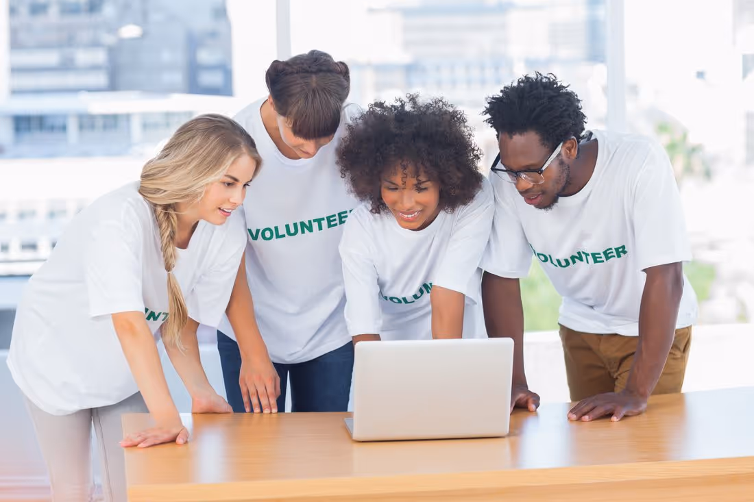
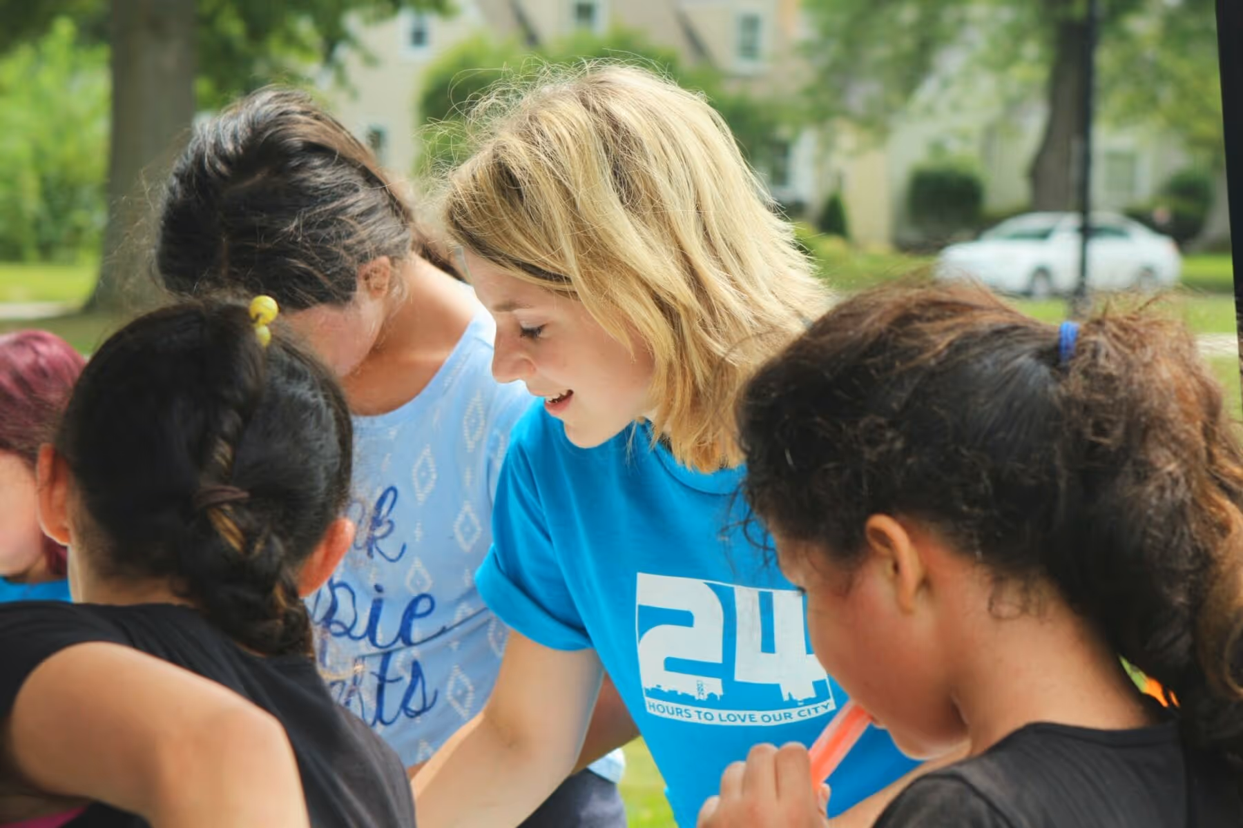
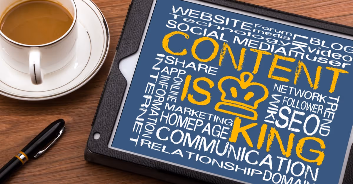
Design plays an increasingly important role in the success of nonprofit organizations. Nonprofits need to communicate their message effectively to their target audience, and this is where graphic design comes in. Effective design can help nonprofits grab the attention of potential donors, volunteers, and supporters. It can help them communicate their message in a clear and compelling way. It can also help them build trust with their audience and create a strong brand identity.
However, designing for nonprofits can be challenging. Nonprofits often have limited budgets and resources, which means they need to be creative and resourceful when it comes to design. They also need to be mindful of their mission and values, and ensure that their design aligns with these.
In this article, we will share 22 tips and best practices for nonprofit graphic design. Whether you are a nonprofit professional or a designer who works with nonprofits, this guide will provide you with useful insights and practical advice to help you create effective designs that support your mission and goals. We will cover topics such as branding, typography, color, imagery, layout, and more. By following these tips, you can create designs that not only look great but also help you achieve your goals and make a positive impact in your community.
1. Use simple, clear messaging that resonates with your audience
In the nonprofit sector, it’s important to communicate your message effectively and clearly to your audience. Simple messaging that resonates with your target audience is key to building brand awareness and establishing trust with potential donors or volunteers. Consider your audience’s demographic, their concerns, and the issues your nonprofit addresses. Use language that is easy to understand and avoid industry jargon or overly technical terms. You want your message to be accessible to everyone. Be sure to focus on the benefits of your nonprofit’s work and how it makes a difference in the community. Highlight success stories and the impact of your organization’s efforts.
2. Utilize color psychology to evoke emotion and create an impact
Color has a powerful impact on our emotions and can be used to create a memorable visual experience. In the nonprofit sector, color can be used to evoke specific emotions and create a connection with your audience. For example, blue can evoke feelings of trust and stability, while green can represent growth and the environment. Red can be used to create a sense of urgency or passion. Choose colors that are appropriate for your nonprofit’s mission and brand identity. Utilize color psychology to create a visual impact that resonates with your audience and reinforces your message.
3. Choose fonts that are easy to read
Fonts can have a significant impact on the readability of your nonprofit’s messaging. Choose fonts that are easy to read and avoid overly decorative or cursive fonts that may be difficult to read. Sans-serif fonts like Arial, Helvetica, or Open Sans are great options for digital designs while serif fonts like Times New Roman or Georgia are better suited for print designs. Be sure to match the font to the tone of your messaging. For example, a playful font may be appropriate for a youth-oriented nonprofit while a more serious font may be better for a nonprofit focused on policy advocacy.
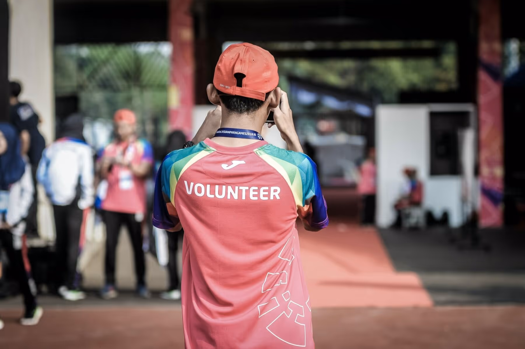
4. Use images and graphics that are relatable and tell a story
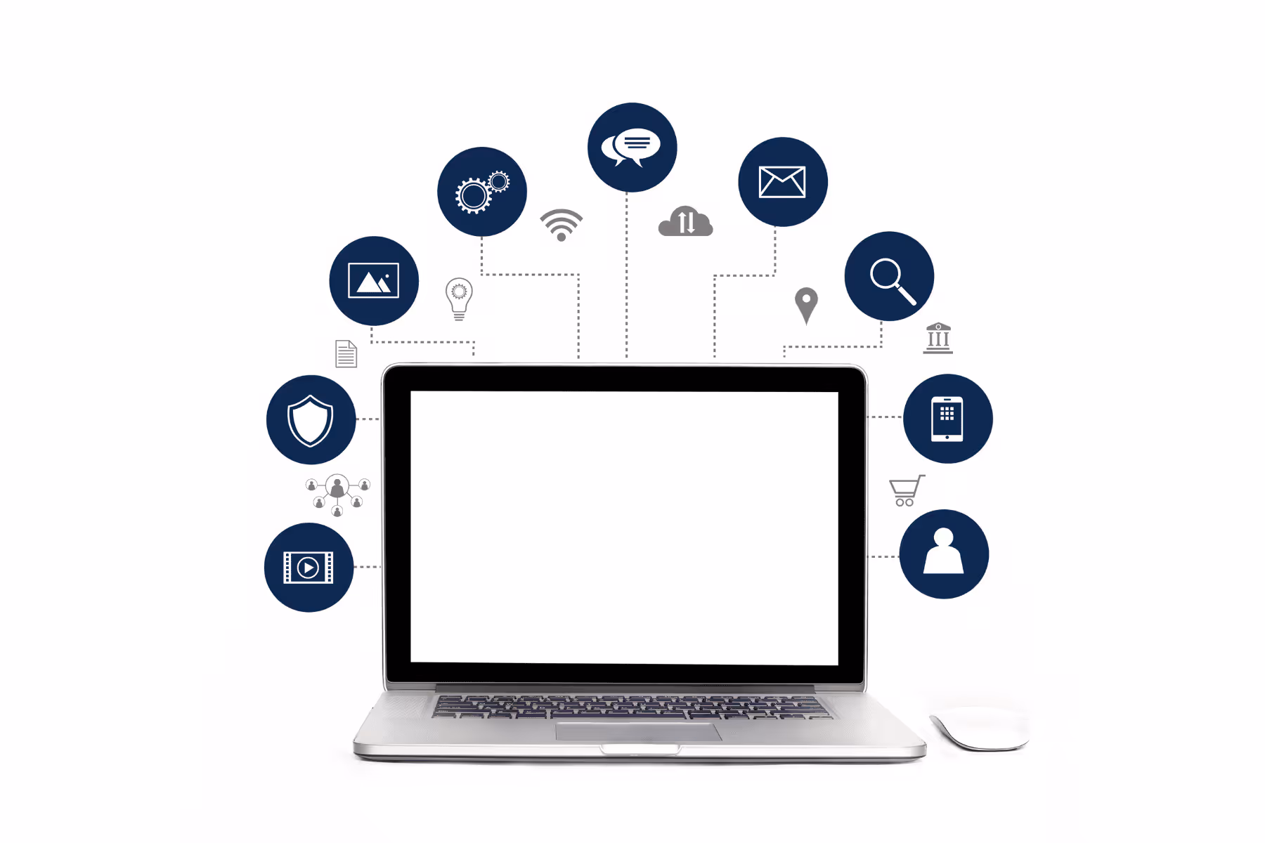
Images and graphics are powerful tools for storytelling and can help your nonprofit’s message resonate with your audience. Choose images that are relatable and tell a story. For example, if your nonprofit works with animals, use images that show the animals in their natural habitats or interacting with humans. Be sure to use high-quality images that are properly optimized for web use. Graphics can be used to illustrate data or complex information in a visually appealing way.
5. Incorporate your nonprofit’s brand and visual identity into all designs
Consistency is key when it comes to branding. Your nonprofit’s brand and visual identity should be incorporated into all designs, whether it’s for print or digital media. This helps create brand recognition and establishes your nonprofit’s identity in the minds of your audience. Use the same color scheme, fonts, and graphics across all designs to create a consistent and recognizable brand identity.
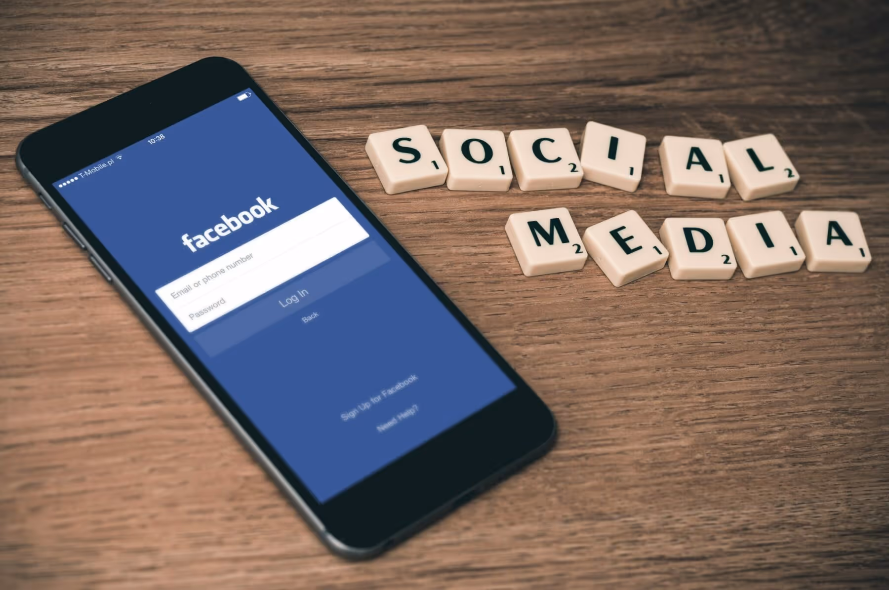
6. Keep designs consistent across all channels (print, digital, social media)
In addition to keeping your brand identity consistent, it’s important to keep designs consistent across all channels. This helps establish a professional and cohesive look for your nonprofit. Whether it’s print, digital, or social media, your designs should have a consistent look and feel. This means using the same colors, fonts, and graphics across all channels.
7. Prioritize accessibility for all users, including those with disabilities
Accessibility is an important consideration in design. Your nonprofit’s messaging should be accessible to all users, including those with disabilities. This means using alt text for images, using high-contrast colors for text, and ensuring that all text is readable for those with visual impairments. Be sure to follow accessibility guidelines for all designs to ensure that everyone can access your nonprofit’s messaging.
8. Use whitespace to create a clean and organized layout
Whitespace is an important element in design. It helps create a clean and organized layout that is easy to read and visually appealing. Use whitespace to separate elements of your design, draw attention to important information, and create a sense of balance. Be sure to use whitespace effectively to create a visually appealing design.
9. Avoid cluttered designs that can overwhelm the viewer
Cluttered designs can be overwhelming and difficult to read. It’s important to avoid designs that are cluttered or difficult to navigate. Use whitespace effectively and prioritize the most important information. Be sure to use a clear hierarchy in your design to guide the viewer’s eye and make it easy to read.
10. Use high-quality images and graphics that are properly optimized for web use
High-quality images and graphics are important in design. Be sure to use images that are properly optimized for web use to ensure fast loading times and a smooth user experience. Use high-quality graphics and illustrations to create a visually appealing design.
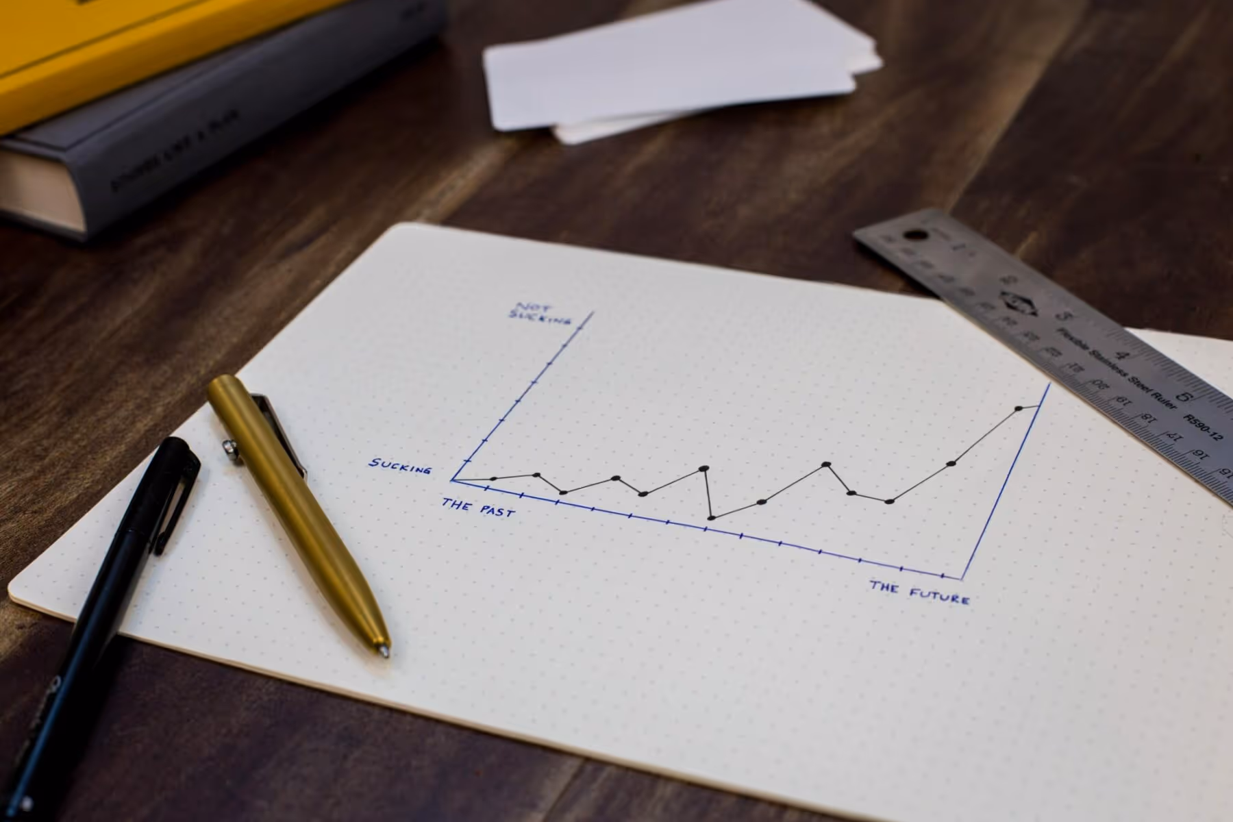
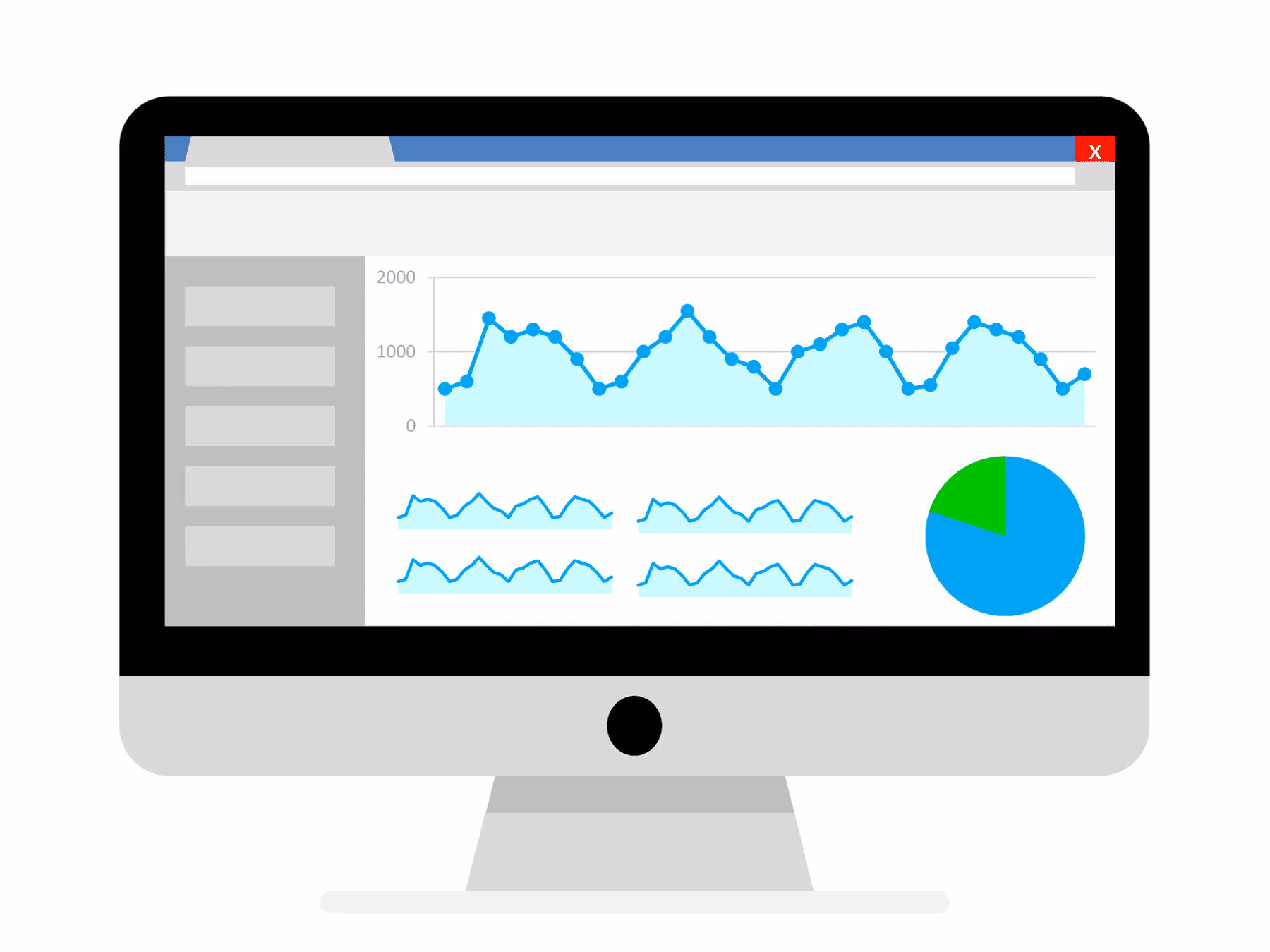
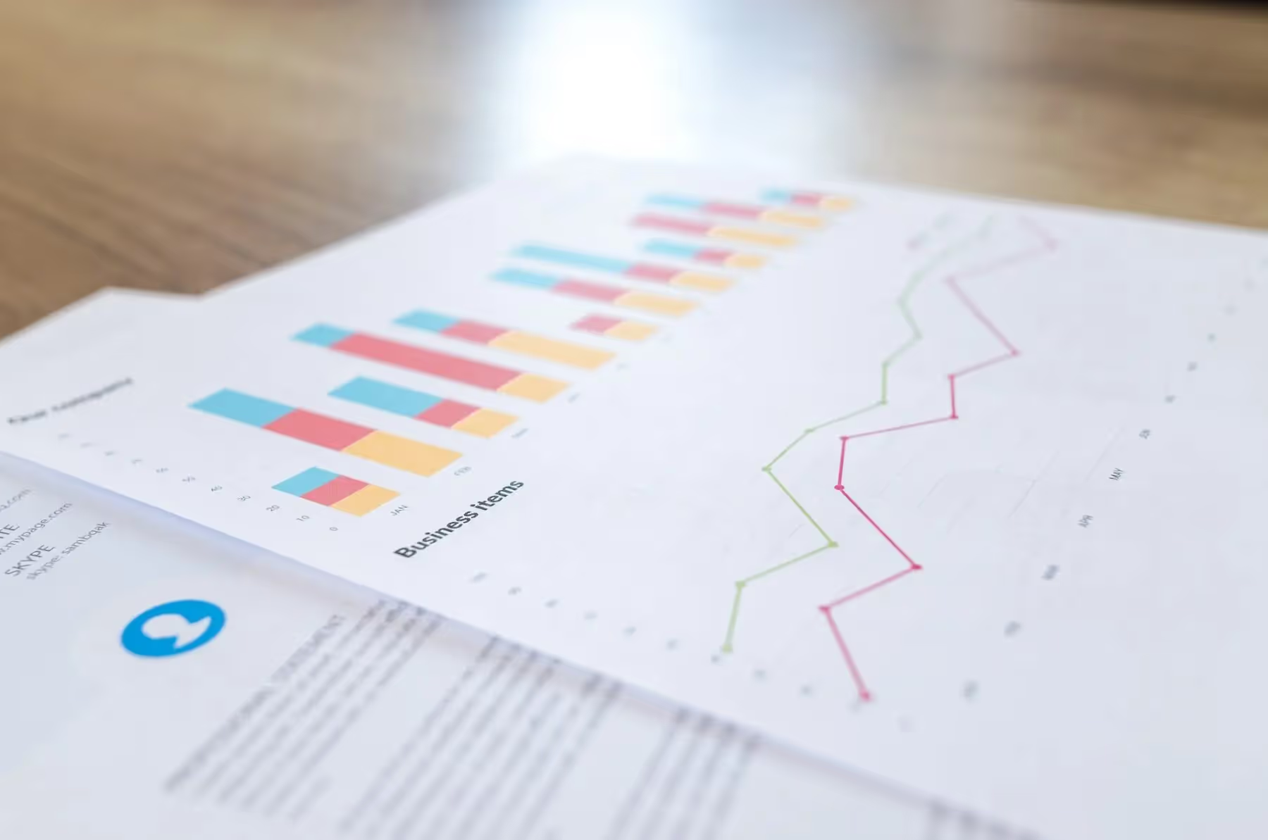
11. Incorporate infographics and data visualization to communicate information quickly and effectively
Infographics and data visualization can be used to communicate complex information quickly and effectively. Use these tools to illustrate data, statistics, or other information in a visually appealing way. Be sure to use clear visuals and easy-to-understand language to make the information accessible to everyone.
12. Use contrasting colors to draw attention to important information
Contrasting colors can be used to draw attention to important information. Use high-contrast colors to highlight calls to action or other important messaging. Be sure to use colors that are appropriate for your nonprofit’s brand identity and mission.
13. Use typography to create hierarchy and guide the viewer’s eye
Typography is an important element of design. Use typography to create hierarchy and guide the viewer’s eye. Use larger fonts for important information and smaller fonts for less important information. Be sure to match the font to the tone of your messaging.
14. Consider the cultural context and audience of your nonprofit when designing
Cultural context and audience are important considerations in design. Be sure to consider your nonprofit’s target audience and their cultural context when designing. Use images and messaging that are appropriate for your audience and avoid anything that may be culturally insensitive.
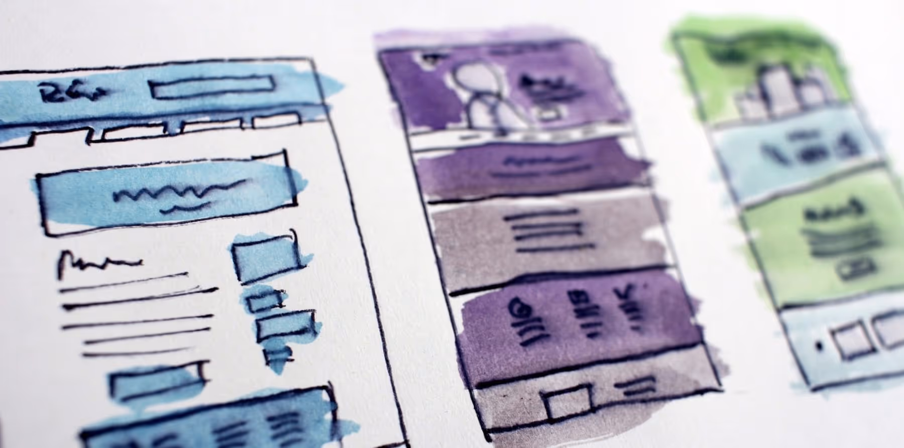
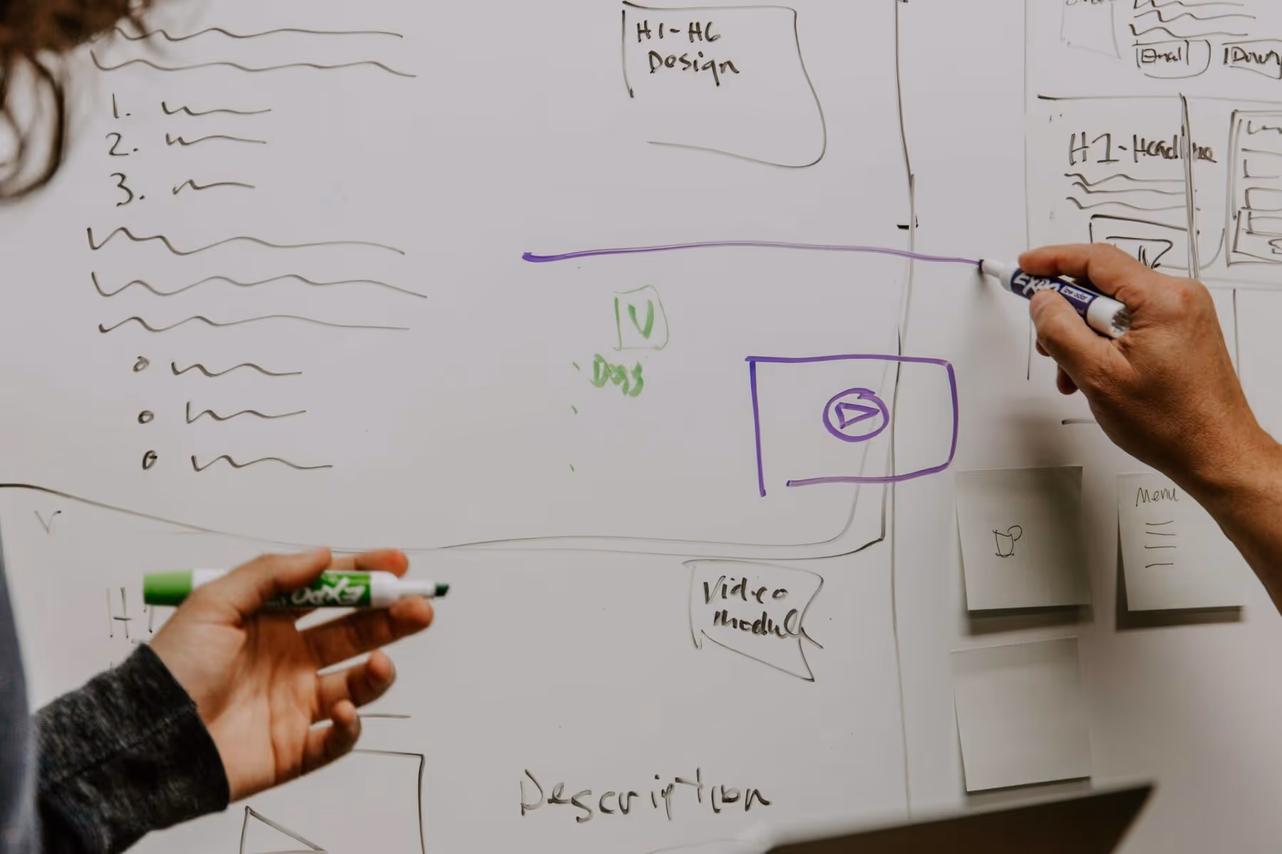
15. Utilize templates and design systems to save time and keep designs consistent
Templates and design systems can be used to save time and keep designs consistent. Use templates for commonly used designs like social media posts or email newsletters. Design systems can be used to establish a consistent look and feel across all designs.
16. Test designs with focus groups or user testing to ensure effectiveness
Testing designs with focus groups or user testing can help ensure that your nonprofit’s messaging is effective. Use focus groups or user testing to get feedback on your designs and make improvements as necessary.
17. Use design to create a sense of urgency and encourage action
Design can be used to create a sense of urgency and encourage action. Use high-contrast colors, bold typography, and clear calls to action to create a sense of urgency and encourage your audience to take action.
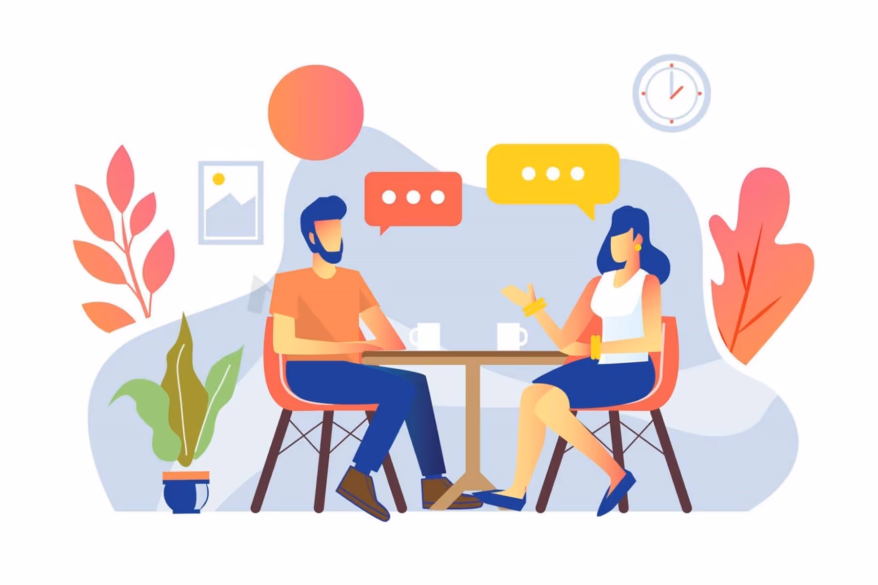
18. Incorporate storytelling elements into designs to create an emotional connection with the viewer
Storytelling elements can be used to create an emotional connection with the viewer. Use images and messaging that tell a story and highlight the impact of your nonprofit’s work. Use storytelling elements to create empathy and connect with your audience.
19. Use design to showcase the impact of your nonprofit’s work
Design can be used to showcase the impact of your nonprofit’s work. Use images, data visualization, and other design elements to illustrate the impact of your nonprofit’s efforts. Use design to create a sense of pride and accomplishment among your supporters.
20. Utilize design to create a sense of community and belonging among supporters
Design can be used to create a sense of community and belonging among supporters. Use images and messaging that highlight the importance of community and the impact of your nonprofit’s work. Use design to create a sense of inclusivity and belonging among your supporters.
21. Consider the environmental impact of printed materials and opt for eco-friendly options
The environmental impact of printed materials is an important consideration in design. Opt for eco-friendly options like recycled paper or soy-based ink. Consider digital options like email newsletters or social media posts to reduce your nonprofit’s carbon footprint.
22. Continuously evaluate and improve your designs based on feedback and data:
Continuous evaluation and improvement is important in design. Use feedback and data to make improvements to your designs and messaging. Be open to feedback and willing to make changes to ensure that your nonprofit’s messaging is effective and resonates with your audience.
Conclusion
In conclusion, designing for good is not just about creating aesthetically pleasing graphics, but it is also about communicating the values and goals of a nonprofit organization. By following the tips and best practices discussed in this article, you can create designs that not only engage your audience but also inspire them to take action.
Remember that designing for good is not a one-size-fits-all solution. Each nonprofit organization has its unique goals, values, and audience, so it is essential to tailor your designs accordingly. By understanding your audience and creating designs that resonate with them, you can create a lasting impact.
Design is a powerful tool for social change, and it can help nonprofits amplify their message and achieve their goals. By incorporating these tips and best practices into your design process, you can create designs that inspire action and create a positive impact on the world.
As a nonprofit organization, your mission is to make a difference in the world, and your designs play a crucial role in achieving that mission. So, invest in your design process, collaborate with your team, and always put your audience first. With the right approach, you can create designs that not only look good but also do good.
.svg)
.svg)
.svg)
.svg)

.avif)


.svg)
.svg)
.svg)
.svg)