.svg)

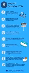
9 Best Practices to Optimize Your CTAs
As Google Ad Grant experts, we frequently (always) are asked how to increase conversion rates. Of course, there are many steps you can take to boost your conversion rate; one that is sometimes overlooked is the call to action (CTA). Yes, that small aspect of your website carries a lot of weight in the conversion toolbox.
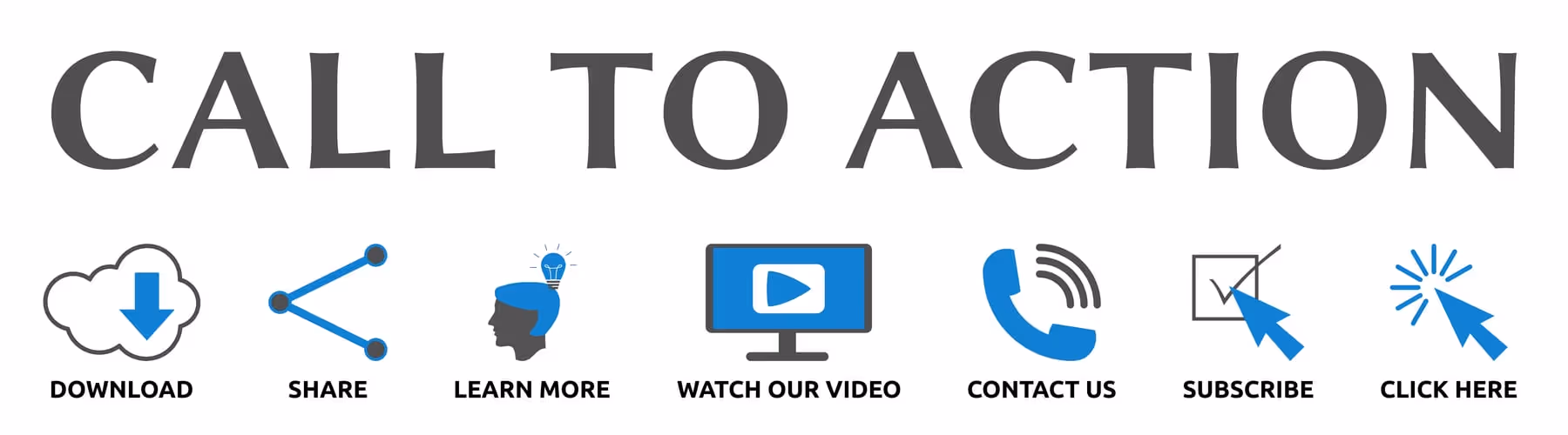
Whether you want visitors to subscribe to your blog, make a donation, sign up to volunteer, or create a fundraiser, they all require that they take action. They may not take action the first time they visit your site, or the second, or the third, but at some point, if you’ve managed to pique their interest, they’ll hopefully be enticed to take the plunge. Your job is to make it as easy and straightforward as possible.
Imagine that you’re taking a trip. You set your GPS to map out the route for the journey, but rather than a definitive course, you only receive vague instructions on how to reach your destination. That’s what happens to visitors to your site when your CTA isn’t clear.
You Don’t Have Much Time
You have seconds, yes, only seconds, to make an impact. A study measuring how long people can focus on one thing for a specific amount of time conducted in 2000 showed the average person’s attention span was about 12 seconds. Flash forward to 2015, and the average human attention span dropped to eight seconds.
A more recent study suggests that our collective global attention span is narrowing because of the abundance of information presented. According to a 2020 survey, the average American had access to more than ten connected devices in their household, giving them endless choices about what to consume.
9 Best Practices to Optimize Your CTAs
If you want your audience to take the next step, you need a compelling CTA. Without it, your conversion rate will suffer. While it’s not always possible to predict what will work, split A/B testing will help you determine what works and what doesn’t. However, you can follow some recommended best practices to get started.
1. Attract Attention
Research shows that people don’t so much read your website as scan it. You need to attract attention if you want to persuade a visitor to take action. You can accomplish this with a combination of font, design, and placement on the page to ensure your CTA button or form jumps out from the rest of the content—even during a quick scan.
2. Keep it Simple and Brief
Skip the wordy and cluttered CTA. Don’t make visitors have to dig to uncover what action you want them to take. They will only confuse and annoy people, rendering your CTA ineffective. Instead, tell readers precisely what you want them to do. A general rule is that it should align with a single conversion goal at the center of your campaign, i.e., attracting donors or volunteers.
3. Make the Next Step Clear
Stick to plain language, so visitors know what to expect when they click on your CTA button. People are hesitant and less likely to click on a link if they don’t know where it’s taking them, so be clear on what the next step will be—whether it’s a registration form for an event, a form to subscribe to your newsletter or a request for more information.
4. Create a Sense of Urgency to Motivate People to Click
Use action verbs that point to results—“get,” “download,” “start,” “reserve”—to build momentum. Another option is to use first-person point-of-view (“Sign me up!”), positive affirmations (“Yes, I want to help children in need”), or creating urgency-based wording (“Tickets are limited. Claim yours today!”).
5. Consider Using Reverse Psychology
You may have seen this type of CTA on a website pop-up. It’s become prevalent in the last few years, purely because it works so well. The idea is to offer the user two choices. Rather than a simple “yes” or “no,” push the user toward the action that results in conversions for you.
There’s a great example of this trick on Neil Patel’s blog, which offers readers tips and tricks to boost traffic and conversion rates. A question asks: “want more traffic?” with two options available: “Yes, I want more traffic,” or “No, I have enough traffic.”

Of course, no website owner will turn down the opportunity for more traffic. Reading this causes the user to stop and think about the chance they’re turning down rather than merely clicking “no” to dismiss the popup.
6. Personalize Your CTAs
Personalizing your CTAs can boost your conversion rate by over 200 percent! That’s not to say that you have to splash personal names everywhere, but if you have the data available and use it to adjust your CTA wording subtly, there can be a big pay-off.
7. Incorporate Responsive Design
It’s important to remember that it’s likely that at least half of your users are browsing your site on a mobile device. Your design should already be responsive to enable people to read and navigate on small screens anyway, but this is doubly important when it comes to your CTAs. Before publishing, make sure that you’ve checked the placement and appearance of your CTAs on a variety of screen sizes and software agents.
It’s easy for visitors to skip over a CTA button that’s been scaled down along with the rest of the site on a small screen. Make sure that it’s still visible and stands out clearly.
8. Design Your CTA So It Stands Out
Your CTA has to stand out against everything on the page to be effective. Using contrasting colors and incorporating plenty of white space around your CTA is the easiest way to do this. If your CTA is the same color as the rest of your text, it will blend into the background. Size also matters – make your CTA text more prominent than the surrounding text.
You want your CTA to be the first thing that the user notices on the page, so don’t surround it with lots of images and other distracting elements. Try to make sure the design draws the eye towards the CTA.
9. Check Your Landing Pages for Broken Links
An effective CTA won’t do you any good if the user clicks and gets a broken page. Make sure you click through all your CTAs and check that the links are going to the right page and all forms are working correctly.
Keep in mind that because you’re entirely familiar with your organization’s mission and goals, your ability to judge whether or not your CTA is clear to visitors may not be accurate. It’s a good idea to ask someone outside of your organization to review your CTA to ensure that it’s clear and concise.
In previous posts, we’ve talked about all the components that work together to help you get the most out of your Google Ad Grant—high-quality content, conversion tracking, loading speed—and there’s no question that those things are critical for success.
However, an effective CTA is a major key to increasing conversions. If your visitors can’t tell what action you want them to take, or they have to excavate your website to find the information, it won’t matter that everything else is in place. If a visitor wants to contribute to animal rescue efforts, for example, and your CTA is cluttered or confusing, they won’t hesitate to find another organization that fulfills that need.
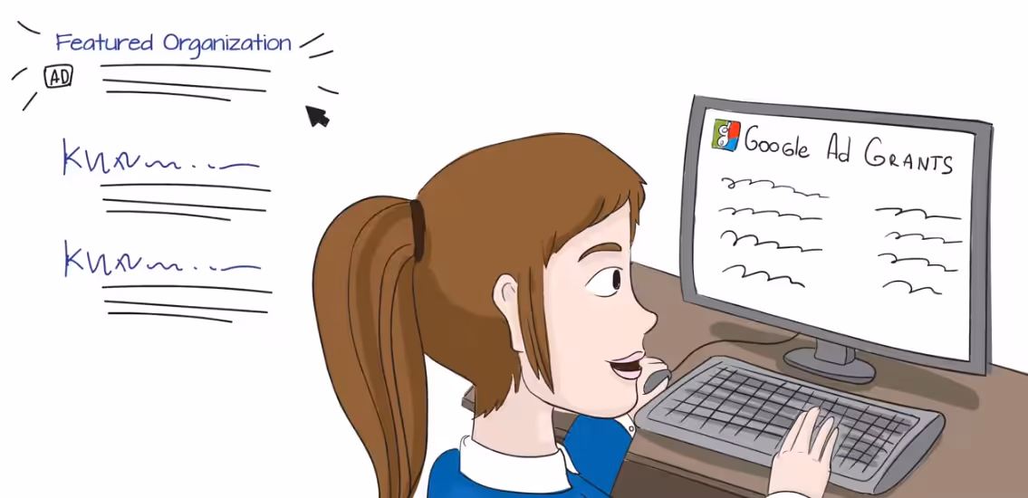
To find out more about how to get the most from your Google Ad Grant, get in touch with our team of professional Google Grant experts. We love helping nonprofit organizations succeed!
.svg)
.svg)
.svg)
.svg)

.avif)


.svg)
.svg)
.svg)
.svg)