Give Your Donate Page a Little Love!
Creating awareness and educating people about your organization and mission is essential, but let’s be honest; your ultimate goal is to convert website visitors to supporters. And if we put it all on the table, volunteers are great, but what you really want are donors.
The financial support of donors is essential to bring the mission of your organization to life. But the value of loyal donors expands beyond their annual or monthly monetary value. Steadfast donors also serve as disciples for your cause, promoting it to their friends and associates and enticing them to support you.
Think of Your Google Ad Grant As a Loyal Donor
It provides a monthly, in-kind contribution, valued at up to $10,000 in advertising, and spreads the word to deliver others to your organization via your website. What action visitors take once they get to your website is up to you.
It’s a bit like advertising a restaurant. The restaurant owner can run advertisements tempting people to dine at the restaurant. That advertisement may get them in the door, but once they’re in the door, it’s up to the restaurant to provide a wonderful experience. If patrons have a quality meal with excellent customer service, they will likely return. They’ll also recommend the restaurant to their family and friends. The advertisements attracted people to the restaurant, and the restaurant produced what the diner wanted.
It works the same way with the Google Ad Grant. Once the Google Ad Grant delivers visitors to your website, it has to take over and convince them to engage. The NPM team of Google Grant experts can work with you to maximize the volume of visitors the Google Ad Grant delivers to your site.
Is Your Website Up To the Task?
As I’ve mentioned in previous posts, your website needs to meet several criteria to allow the Google Ad Grant to do its job. It needs to:
- Contain high-quality content (as mentioned many times, content is king).
- Load quickly (You’ve got about three seconds to satisfy people).
- Offer simple navigation (Visitors will leave if they can’t find what they want quickly).
- Be optimized for mobile devices (Google rewards sites optimized for mobile devices).
If you’ve checked those off, great! But, if your site’s not accomplishing those things, take care of what needs to be done to maximize your impact. When and if you need help, let us connect you to one of our partner website development agencies to set things right. But, there’s more you can do to increase conversions.
7 Ways to Increase Conversions with a Dedicated Landing Page
A dedicated donation landing page is one of the keys to attracting donors and driving donations. Done well, it will allow you to create awareness, provide relevant information about the cause, and persuade people to donate. Here are seven ways to develop high-converting donation pages:
- Craft a Compelling Headline
The headline on your donation page is the first thing visitors see, so it needs to capture their attention and generate interest quickly. The value of a compelling headline can’t be stressed enough.
Advertising and copywriting guru, David Olgivy, put it this way, “On average, 5x as many people read the headline as read the body copy. When you’ve written your headline, you’ve spent eighty cents out of your dollar.”
Keep it simple and specific by telling people exactly what to do. Consider using the following headline writing
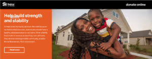
tactics for your donation page:
- Demonstrate the impact or benefit (e.g., Your organization helped 12,000 feed their families).
- Create a sense of urgency (e.g., Your donation can lift a child out of poverty today).
- Share a startling statistic (e.g., One in 10 people lack access to clean water. We’re on a mission to change that).
- Make an appeal (e.g., These children need your help).
2. Give People a Reason to Donate
Great! You’ve developed an attention-grabbing headline; now you need to create the supporting or body copy. The supporting text should tell your story, giving people a reason to donate. Ask yourself a simple question: Why should people care about this cause? The supporting copy should answer that question. Here are some elements you can cover while crafting the donation landing page copy:
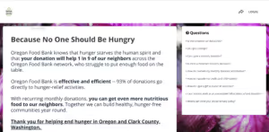
- Introduce the cause
- Offer context or background information
- Tell people why they should donate
- Communicate the benefit or impact the donation will have
3. Share Real-Life Stories
Nothing tugs at the heartstrings like a good story. Go beyond merely educating people and show them how their money will be used. A story can help you establish a deeper connection with visitors to your site. Many donors appreciate this approach because being transparent with donors breeds trust. Some people are more comfortable knowing how their donation will impact or change lives before choosing to donate.
4. Incorporate Impactful Visuals
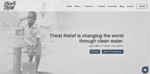
As mentioned earlier, a strong headline is essential, but just copy alone won’t keep visitors engaged. Incorporating powerful visuals that support the narrative and emotional appeal can help you effectively make your case. Content with relevant visuals increases the view rate by 94percent! Options include:
- Photos of the people (or animals) who will benefit from donations.
- Infographics that visualize key statistics highlight your cause or make comparisons.
- Icons and illustrations that outline the benefits of donating.
- Videos of projects or people who have benefited from your work.
- Interactive content such as maps, calculators, and quizzes can also generate interest and involve website visitors.
5. Create a Simple, Easy Form
Even the most visually-appealing donation landing page won’t work if your donation form is overcomplicated. Make forms as straightforward as possible for people to complete them. How? By making them brief! Only ask for essential information such as their name, email address, and payment details.
Another way to keep it simple is to offer donation amount options. One person might be comfortable donating $50, but the same amount might be too high for someone else. By giving options, you increase your chances of increasing donations.
6. Make Your Call-to-Action Button Prominent
You’ve taken all the right steps to inspire action and drive people to click on the call-to-action button. Place the call-to-action button in a prominent location and make sure it is visible on the page. Your donate button may be aesthetically pleasing, but if it doesn’t stand out, you run the risk of people not noticing it.
Another important aspect is the call-to-action button copy. While a simple “Donate” will work, you might also want to consider using more powerful, action-oriented words to grab attention and incite action. For example:
- Take action.
- Join the revolution.
- Change lives today.
- You Can Make a difference.
7. Optimize for Mobile
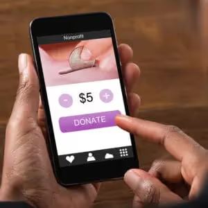
Half of all nonprofit website visits came from users on mobile devices. In 2018, Google announced that it would be indexing websites based on their mobile versions, not their desktop version. The result: if your website is not optimized for mobile, you’ll get reduced Google traffic and, therefore, decreasing conversions. Many of the things mentioned earlier also help with mobile optimization. Here’s how you can ensure your landing page is more mobile-friendly:
- Create a responsive design so that it smoothly adapts to different screen sizes.
- Make it simple to navigate.
- Use minimal text, bold fonts, and a clean layout.
- Use images that are smaller in size.
- Ensure the page loads quickly.
- Offer short and easy-to-fill donation forms.
Learn how we’ve helped clients promote their cause and attract new supporters. Let us know if you have any questions. We love helping nonprofit clients succeed.
.svg)

.svg)
.svg)
.svg)

.avif)




























.svg)
.svg)
.svg)
.svg)