Home renovation shows on HGTV are my favorite. I love watching the TV hosts take an ugly house and spruce it up. It is a little different, however, when you’re renovating your own home. You have to make plans, deal with dust and the stress if it doesn’t go exactly as planned. Whenever you reach the conclusion that you need to give your website a facelift, it can be daunting. Unless you’re a coding expert who makes websites all day long and you know exactly how you want your site to look, it can be difficult to begin to know where to start to revamp your site. Fortunately, this Ultimate Game Plan Guide is here to help you create a successful game plan in three essential areas:
- Your Goals
- Your Content
- Your Design
After much research, I have discovered that these are the three main areas you need to focus on when you are redoing your website. These three will cover both broadly and in detail most every aspect you need to consider while you treat your website to some TLC. Stay tuned, get your notebook out, take notes and go forth into a world of better websites.
Part 1: Goals Game Plan

Making a solid goals game plan is one of the best things you can do for your website. By making your website work for you, it’s that much easier for you to achieve your organization’s goals.Think of these as the blueprints to your new website–and you’re the architect. Like blueprints, these will direct your renovation so your new place is everything you ever hoped it could be.
Goals

Making concrete goals can only help you as you go about the transition to a newer, better website. Think about what you want your website to accomplish. Are you trying to drive sales? Get phone calls? Newsletter sign-ups? Donations? Marketing Mo puts it best when they invite you to put yourself in your audience’s shoes (read their full article here) and think about what they want and how you can get them to do what you want. They have all kinds of great questions that you can use as a springboard as you begin to think about your goals–like how often you want your audience to visit, what kind of people they are and what actions you want them to take.
If you aren’t sure what your goal is or should be, think about what the single greatest action anyone does on your website. A counseling center might highlight their services and their phone number since their goal would be to get patients. A fitness center might want to highlight their free trial to get people actually into their gym. Whatever your past data tells you is the single greatest action someone takes, highlight that. You can have subgoals, like a newsletter or app, but you should define what the one thing is that makes a difference to you.
Message

Define a message. Whatever your organization’s message is–make sure that is front and center. Your message is whatever you want people who have looked at your website to remember about you. Whether you have a catchphrase or a sentence that describes who you are, make that the theme of your design and content. Everything on your website should in some way link back to whatever your message is. For instance- on the Nonprofit Megaphone website, our message is “Helping Nonprofits Thrive.” Thus, everything we post on our blog, all of our testimonials, and all of our content about what we do is centered around how we seek to help nonprofits with their world wide web needs. Are you helping the children of Haiti? Or are you literally building your community? Are you healing, educating, employing or insuring people? Whatever your niche is that you have found to make your organization successful–nonprofits and for profits alike– make that what everyone who comes across your website knows the instant they click a link and land on your page.
This might seem intuitive, but some of the best organizations have the worst websites because they are trying to accomplish too many things as their main goals. Their goal is to have people donate and take part in their programs, but they also might have pages and pages of educational materials that they have placed more prominently than what they actually want to highlight. Pick one major area, education or services, and highlight that most. Obviously, they should be somewhat intertwined, but whatever is most important to you should take the spotlight. Trust me, there will be a place for all that award winning content you’ve written to educate people and there will also be a place where you can offer your services after you have won your audience over with your educational materials. But if you try to do both in equal force, neither one will do as well as you had hoped.
Rotating Goals

Utilizing rotating goals is great when your goals do not stay the same throughout the year. Most organizations hold at least one type of fund raising event throughout the year, though some I know of have 3-4 throughout the year. If this is you, then make sure to account for these in your game plan. Your message should stay the same, but you should allow for some sort of flexibility on your website that allows you to showcase whatever furthers your message and is a rotating goal.
A good example is a typical magazine website. They usually have some sort of message board that showcases their latest articles, and it may be focused on just one and change, or it may be a list. For organizations not pushing that kind of content, the first one is best, but we’ll deal with the design of it in the next section. Either way, if your events become the number one goal over conversions, sign ups, etc. be sure to write this into your game plan and include when during the year you want it to be the focus. Whether you sell gala tickets for 3 months or 3 weeks in advance you need to make sure that your website is optimized for those kinds of conversions during that time.
Convinced to make a game plan yet? If there’s one thing I want you to take away from this article: make a game plan. Your game plan will help you make the smartest decisions in the next two sections to accomplish what you want.
Part 2: Content Game Plan

As you are creating your awesome game plans to make sure you have the most effective website, you need a game plan that directs your content output. By creating what I call a marketing mantra and also a content planner, you can ensure that all of the content on your page is Grade A. Think of this as the bones of your website–like the drywall or plumbing in a house. If your drywall is weak or your plumbing doesn’t work, it doesn’t matter how pretty you make the house because the house will always be faulty. In the same way, spending time and working hard on your content is better than any design you could ever give it.
Your Marketing Mantra
A mantra is a statement or slogan repeated frequently. Your marketing mantra is a phrase or message that you should “repeat” with every piece of content on your website. Whether it’s your contact page, homepage or blog post, every piece of information you post on your website should convince your audience of your message.
As I have mentioned in other places, Nonprofit Megaphone’s mantra is “Equipping Nonprofits to Thrive” and so every piece of information we have on our website somehow furthers our visitor’s knowledge of how we specifically help nonprofits thrive. Nonprofits are our focus and our market, and we do everything we can to convince anyone who might come across our website that they matter to us.
Once you have decided what your mantra is–could be your tagline or just a general description of what you do– make that mantra inescapable for you and everyone on your team. Tape it on your bathroom mirror at home or at the office, put a sticky note on everyone’s computer, get it framed, make motivational posters or even create a wall mural so no one on your team can forget it (if you actually make a mural, tweet us a picture at @npmegaphone and me at @samazingirl). Do whatever you have to do to inspire every single piece of content published to spectacularly convince everyone of your mission.
Content planner
There are two main ideas you need to keep in mind as you plan your content: what kinds of content you’ll have and how will you further your conversation. These two may not create a calendar of content, but they will ensure that your content is consistent and valuable.
Define Your Content

Whether you run a blog or social media channel connected with your organization or not, you need to plan in advance what kinds of content you will have on your site.
Are you an organization that testimonials would benefit? Or are you an organization that benefits from having a newsletter? Or both? Whatever you find works for your organization, use that as the springboard.
Generally, you must have content like your contact information, backstory and run down of your services. Make sure you take the time to define concretely how you can make these three important pieces of information accomplish the goals of your website. Don’t forget to plan the other elements you want on your websites like a blog, testimonials page, or webzine and how they will further convince your audience to achieve your goals. Define what you’ll publish when on your blog and social media channels, and how you can utilize that sort of content to reach out to people who may not regularly go to your site.
You might think this is a bit excessive, but what this allows you to do is greater than the act itself. By carefully defining your content you can ensure that your website has a momentum that accomplishes your goals, and every individual piece of information on your website pushes your website forward. I visualize websites like rivers–they have a momentum and a goal. Everything you put on your website can either be a dam or waterfall. A single, little dam may not stop the river altogether, though too many certainly would. But a waterfall helps your river gain more momentum to reach its goal of the lake or ocean. Make waterfalls, not dams.
Further Your Conversation

This is more of a general guideline for those who publish written content on social media, blogs or articles, but can still apply to those who don’t. Make sure everything you publish somehow furthers your conversation. Just like you wouldn’t like reading the same 5 articles and fashion tips in all of the fashion magazines, don’t publish the same content that has been circulating for awhile. It gets boring and turns your audience off to your content. One or two pieces that are similar to what others are publishing is okay, but the more recycled content you post, the more your audience’s eyes glaze over. This doesn’t mean you can’t share what someone else has generated, but if they’re sharing the same top 10 marketing tips, you shouldn’t.
I know planning your content on your website can seem very time consuming, particularly if you have a lot that you want to share with the general public. But the better you can organize and optimize your content, the better you’ll be able to reach the public. We’ve all seen sites jumbled with too much information–some of which is relevant and helpful, some not. Being intentional can only help you, trust me.
Part 3: Design Game Plan

Unless you are building your website yourself, think of this section as a game plan like you created earlier with your goals, but entirely focused on the physical attributes of your website. Here, you need to consider the psychological strategy of your site, how you’ll use the elements of your website to point users towards your goals, and the tools you need on your website. These three elements are the cornerstone that accomplishes your goals above and showcases the awesome content you have created.
Pointing users to your goals
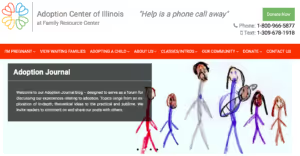
Via adoptioncenterofillinois.org
As you begin to think about what form all these game plans will take on your website, you need to keep those goals you identified up in the “goal game plan” front and center. Think carefully about how you can make the links, buttons, or banners that serve to accomplish your goals front and center.
One website in particular, the one for Adoption Center of Illinois, is extremely effective in getting their message across. They have a donate button on the top right of every page (see the picture to the right). It’s clear to see what’s important to them, and it’s easy to give, no matter what page you’re on. They’ve also made their content match their message, ‘help is one phone call away”.

On the other hand, a well-known church in my area is sensitive about asking for donations, so they have “get to know us” tabs on the bottom of every page and the donations link is buried in a tab for current attendees of the congregation. Their main goal is for new people to learn about the church and what it stands for before being encouraged to donate. So take these examples and consider how your organization might incorporate them into your design.
Even if you’re not building your website yourself, your website builder will thank you for having goals and an idea of what you want to highlight. If it’s a large button to sign up for your newsletter or to volunteer or apply for a job, now is the time to ensure that your goal is front and center.
If you have rotating goals, now is the time to decide how you want to best showcase them. I don’t suggest switching out the links of large buttons because that might confuse people. But that doesn’t mean you don’t need to decide what and where you want your banners for your current event you’re highlighting. With web design, the world is your oyster–so you can even utilize seasonal banners if you have the skills to add or delete them easily available. Just make sure to keep it classy, because no one likes that website with a million pop-ups and banners, making it hard to get to the content you’re actually searching for. Everything in moderation.
Incorporating Psychology

Whether we want to admit it or not, color and behavioral psychology can make or break a great website. This is a broad field and encompasses volumes of knowledge which can seem somewhat daunting to navigate, but have no fear! We’re here and we’ve broken it down so you can easily incorporate it into your design game plan.
First, we want to highlight this great, in-depth study, by Kissmetrics blog about the psychology of color. Essentially, their technique boils down to defining your website goals and then choosing colors that accomplish your purpose and highlighting those on your website. Are you energetic and fun? Or are you luxe and aloof? Or perhaps you’re relaxed and calming. Whatever your “vibe” is ([pardon the millennial word), there’s a color that accomplishes your purpose. Definitely head over to their article to look more in-depth and check out their awesome suggestions that you should be incorporating.

Second, we want to highlight this amazing piece by Shane Barker via Vandelay Designs that incorporates behavioral psychology and web design. This covers everything from colors to landing page length and how each affects user interaction on the site. He makes suggestions like shortening your landing pages, streamlining certain processes to get your users to complete actions that further your goals, and optimizing your colors to get your audience to accomplish your goals. As you get into the nitty gritty of creating your webpages and organizing your content, consider his amazing suggestions that are sure to help you make the most effective website you can.
Utilizing psychology can only help you as you make decisions about the design elements of your new website, which is why we happen to think it’s as important as your goal and content game plans. While the wrong choices psychologically-wise might not completely kill your website effectiveness, making your colors and page lengths work for you instead of against you will only be to your organization’s benefit in the long run.
4 Tools your website needs
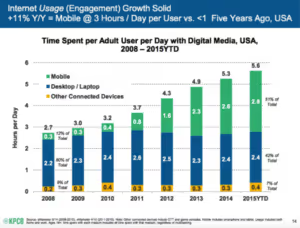
Mobile Platform
Repeat after me: Mobile traffic is the future.You might think it’s wishful thinking as you hug your 1980’s era desktop mac like Rose should have clung to Jack on the Titanic, but the reality of the data suggests that mobile devices (excluding tablets) are taking over the search world. This (now outdated) graph shows that even in 2015 the mobile traffic had taken over the tablet and desktop traffic.
According to Smart Insights, the latest study done on mobile browsing time, again in 2015, shows that in the month of August that year, the unite states spent 87 hours on average browsing on a mobile phone. That’s roughly 1.2% of our time on our phones. To put it in perspective, we spend 22% of our time at work (assuming we’re not on our phones at work) and 33% of our time sleeping during the month (assuming you’re all getting 8 hours a night). We spend about 3 hours a day in America browsing our phones. Thus, if you don’t have a great mobile site, then you need to join the party and enjoy all of the benefits you’ll reap.
Easy navigation (that works)
One of the most annoying things is when you’re looking for specific content on a website, and the search function isn’t a smart search, making it nearly impossible to find the content that’s there. So, as you go about building your website, or making a list of your must-haves on your website, make sure you either include a great search bar or no search bar at all. A bad search bar is more likely to turn away possible conversions than not having any at all.
FAQ page

Raphael Paulin-Daigle over at Under 30 Ceo reminds us why a FAQ page is what you absolutely need on your website. He says: “I am sure there are some questions you keep being asked. Every time, you reply the same answer over and over again, and this makes you lose some valuable time; so, how do you easily avoid that? Simple. Set up an FAQ page.”
The genius is in the simplicity. You could even incorporate this into your “about us” page (which I’m assuming you have. If not, do that first). Answer questions like “where do I get involved?”, “how can I give?” and anything else you get asked on a regular basis. Find his full article here.
Social Media Buttons
Some people have been slow to adopt social media into their nonprofits and businesses, (if that’s you read this so we can hopefully convince you that it’s worth your time), but for those of us who embraced it, make sure you put buttons somewhere easily accessible on your page so your potential conversions can follow you everywhere and hopefully stay engaged. They’re fairly easy to add and can only help your brand awareness. The more you can show up on someone’s feed, the more likely they are to engage with you in the future and the more likely they are to become a conversion (however you measure that). Social Media is essential for your new, shiny website to take off.
Conclusion & Bon Voyage

Congrats! You’ve completed the Ultimate Game Plan Guide To Your Website Renovation! Chip and Joanna will be so proud. Hopefully, these tips and techniques can help you have an awesome, effective website in the future. If you are willing to put in the hard work, it can only help you in the future to accomplish your goals on your website. Once you get your website fully renovated or if you want to show off how you’re going about creating your game plan, tweet us pictures at @npmegaphone and tweet me at @samazingirl! Happy renovating!
.svg)


.svg)
.svg)
.svg)

.avif)












































.svg)
.svg)
.svg)
.svg)