First impressions mean a lot, especially in the digital world. Your nonprofit’s website is the face that greets potential donors, volunteers, and even staff members. You want to make sure it stands out and opens the door for these newcomers to visit and stay awhile. There are a few basic elements that make up a successful website.
There are many website builders that do a lot of the work for you. Great news, right? They provide templates for you to choose from and easy access to technical support. You can even contract out and get a professional to build your nonprofit’s website. For those tackling it on their own, let’s run through a few options:
They offer many free templates. They also offer the option to use their features through a self-hosted website. This means you can completely own the domain name, but still have access to templates. WordPress is especially great for blog content.
They have an entire section of templates dedicated to community and nonprofits. This makes it easy to optimize your resources. Their business plans start at $18 per month.
They offer an online store and customizable templates. They also offer a video maker to create customized content for your social channels. Their basic business plan starts at $23 per month.
This is another great, free option. They offer an eCommerce option through Square to sell and ship items if you need that function.
This one was created for nonprofits specifically. Their “start” plan comes in at $99 per month. However, this allows you to use your own domain name and includes donation forms.
Pick the Right Layout
Make sure you choose a layout that makes sense for your organization. Do you feature animals? You’ll need one with plenty of space for images. Maybe you focus more on storytelling—textual elements will be your friend. Make sure the tabs at the top of your page or in your menu are easy to sort through. You want anyone visiting your website to find the information they need quickly. Be sure to provide unified branding throughout. This can include logos, a color theme, or even a signature font.
Also, try to make sure your website looks just as good on mobile devices as it does on a desktop. Most website developers offer the option to view your site in a mobile capacity. Menus and images are often distorted, so you want to make sure everything flows. The mobile page is one that most will see first.
Post Engaging Content
When people visit your website, they want to learn the story of your organization. Include several aspects to let them see behind-the-scenes and form a connection with your cause.
- Videos/photos
This can be an overview of your programs, a message from your CEO, or a look into your cause. A video catches the eye and makes people want to learn more. You can also add a slideshow view of fun photos. Feature exciting events and the community your organization supports.
- Testimonials
These can be from people you’ve helped, former members of your organization, or even press coverage of your events. Any words of affirmation from others surrounding your nonprofit is positive. You want to showcase these kind words and recognize the support you receive.
- Your Story
Give people your why. How did your organization start? Who started it? Be a compelling storyteller and you will capture the attention of visitors quickly. You never know who may relate to the story.
- Volunteer Opportunities
Tell people how they can get involved. Make it easy for them to sign up and volunteer for the next event. Give them an overview of your programs so they know where they fit best.
- Graphics
These can be charts or engaging imagery to supplement the text on your website. You already have videos and photos, but imagery and infographics are yet another way to present the important information you have to offer. It helps set the important facts apart.
Be sure to constantly update information and provide new information. You want people to have a reason to come back. This includes video content: the video from 2007 is nice, but people want a fresh look at what you’re up to.
Update Your Contact Information
More times than not, someone is looking at your page to find a way to contact the organization. It helps to have a meet the staff page that includes direct emails or phone numbers to different departments. This is a great place to provide staff bios and photos so people know who they’re speaking to. Make sure the organization’s address and phone number are easy to find. Including this information as a permanent feature at the bottom of your webpage is helpful. You can also include a question box on most sites, giving people the option to send a quick note rather than make a call.
Feature Socials
Link all of your social media platforms on your website. You want people to have the option to follow you and stay current on what’s happening. Also, include an option to share different pages of your website on social media. This makes it easy for people to share your message with their friends.
Some platforms offer the option to add a “widget” to showcase your Instagram or other social content on your website. You can feature your last few Instagram posts or latest tweets, whatever platform you’re most active on. This is great because people become intrigued by the content you’re posting just by visiting your website.
Add a Donate Button
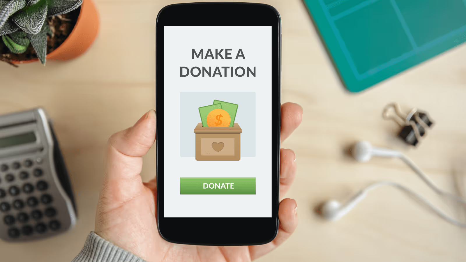
This step is key—include some form of a donate button or donate page. You want this to be easily accessible and show up on almost every page of your website. Also, offer an option for a monthly donation. Many people will donate more frequently if they know it’s built in to their monthly expenses.
This is also a great chance to advertise your newsletter or mailing list. There are even pop-up boxes you can include when a visitor first lands on your site. Give donors the option to stay connected. They want to see where their donations go and remain current on new programs and success stories.
Make it Shoppable
If you sell items through your nonprofit, make sure visitors can easily make purchases on your website. Shopify is a great option for this. There are over 70 free store themes to choose from and you can accept credit card payments securely. You can add item photos and pricing so visitors can easily scroll through on either desktop or mobile and make purchases.
You can also advertise sponsorships of some sort on your website. Maybe supporters can sponsor a child or an animal in need. Give them an option to support immediately.
Include the Facts
Without boring your readers, provide the facts they need to know. Offer a diagram showcasing where all donations go in your organization. Showcase your growth throughout the years and provide numbers people can trust. This also helps when applying for a grant. Those making the decision will go directly to your website to learn more. Provide links to annual reports for these cases.
Successful Website Examples
Below are some outstanding examples of nonprofit websites to inspire your organization. They make the most of every area of their platform and make it easy for the viewer to navigate.
ASPCA
On ASPCA’s homepage, you are met with an adorable puppy stuck behind a cage. They use emotional appeal to draw in the viewer. Their donate button is prominently located on the photo and they offer a newsletter signup just below that. They have a shop page that directs you to their Amazon page so visitors can support through purchases. They also offer success stories and ways to get involved. You leave the page feeling a connection because you inevitably learn something about the organization.
Save the Manatees
While Save the Manatees also uses a compelling photo to draw you in, their branding really sticks out. The entire page features different shades of blue and makes you feel like you’re diving into the water with the manatees. Their use of images also makes the site aesthetically pleasing. They offer easy options to help including an adopt, shop, donate, and act button on their homepage. They also offer a video from the club’s co-founder, Jimmy Buffett. This keeps people on the site longer. All of their contact information and social accounts are easily accessible, making the website pleasant to sort through.
Invisible Children
You are immediately met with Invisible Children’s mission and a background video on their website. They use stark black and white text contrast to make their mission known. Immediately after is their donate button. They then offer links to their different areas of work. They also have an active blog to read more behind-the-scenes stories from the organization. While the content on the page is well-written and detailed, the imagery and use of black and white photos also makes a statement.
.svg)


.svg)
.svg)
.svg)

.avif)
















.svg)
.svg)
.svg)
.svg)