Grants provide much-needed funding to nonprofit organizations of all sizes. But with more and more emphasis on website design, how can you ensure that you don’t lose out on funding opportunities? How should you design your website so that grant-awarding foundations accept your application?
If you’re in the throes of applying for grants this year, website design might be the last thing on your mind. However, it can actually make a big difference for your application. Of course, you want to have a well-designed website to create the best experience for your donors, volunteers, and other supporters, but further optimizing your website with your grant application in mind might give you the boost you need to secure extra funding.
Putting extra effort into creating and maintaining your website is a great way to show grant-awarding foundations your focus on a typical donor’s interaction with your nonprofit and your overall professionalism. We’ve picked our top 4 tips for improving your website’s design to increase your chances of winning a grant:
- Keep it straightforward.
- Highlight your unique qualities.
- Make sure your site is accessible.
- Optimize your site for mobile devices.
A well-designed and thorough website can go a long way with a grant committee, but it also has the added benefit of improving the experience of your supporters. This Kanopi guide to website maintenance can help you properly update and improve your website to maximize user experience. Remember, the stronger that your site can be, the better interaction that grant committee members and users will have with your work.
Before we dive deep into the web design tips we recommend for seeking a grant, let’s review what a grant-awarding foundation is.
What are grant-awarding foundations?
Nonprofit grants are a great way for organizations like yours to get the funding you need to continue forwarding the social good. But what exactly is a grant and how do you get one?
A grant is a financial contribution made to an organization typically by a foundation, corporation, or government entity. Oftentimes, grant foundations have specifications for how an organization should use their funds. For example, some foundations may want their beneficiary to use their contributions to plan community-building events or to construct a new facility.
Most foundations are supported through the generosity of one or more individuals with an interest in supporting nonprofit organizations. The Bill and Melinda Gates Foundation and the Ford Foundation are two prominent examples.
In addition to providing valuable funds for major projects or programs for your nonprofit, grants can also elevate the prestige of your nonprofit. When a grant-awarding foundation recognizes the value of your organization, potential donors are more likely to trust your organization with their contributions.
To receive a grant, you typically have to write a grant proposal. The components of a grant proposal typically include:
- Your mission statement
- A definition of your nonprofit’s goals
- The reasons why you need the grant
So, where does your website come in? Well, having all of the information from your grant proposal easily accessible online can help reinforce the main takeaways from your proposal as a committee reviews your nonprofit online. Additionally, with a well-designed and engaging website, your nonprofit can stand out among all of the other applicants.
Top 4 Website Design Tips
Now that you have a better understanding of grants, grant-awarding foundations, and what goes into your application, let’s dive into our top 4 website design tips that can help you stand out!
Keep it straightforward
When you’re working on your grant application, you want to be as straightforward as possible. This way, it’s easy for the committee judging your application to discern what your organization is about, what you would use the grant money for, and why you’re applying. The same logic applies to your website.
Not only will keeping your website straightforward remind a grant committee of important aspects of your application, but it will also make it easily navigable for supporters. To be straightforward on your website, you should:
- Clearly display your mission statement: Make your mission statement easy to find. After all, it explains everything your organization is trying to accomplish. By clearly displaying it, a grant committee and supporters can quickly and easily understand your organization’s purpose.
- Feature your logo prominently: Your logo is the most likely way that donors, committee members, and other supporters will recognize your organization. Be sure your logo is memorable and on brand with your organization.
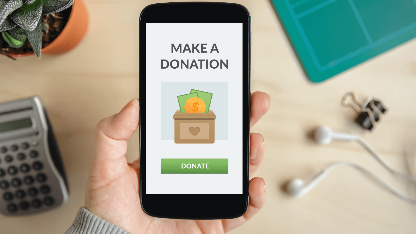
- Make it easy to engage: While this feature is more important for donors than a grant committee, it’s always important that your website is user-friendly and promotes engagement. Have a clear place to donate, display your volunteer schedule, and encourage visitors to sign up for your newsletter or mailing list.
Although you might think of elaborate designs or thorough descriptions as the first priority for your website, straightforwardness can do more to improve your user experience and get your message across. Additionally, grant committees will appreciate your directness, especially if they are considering multiple applicants.
Highlight your unique qualities
While your website should be clear and direct, it also should be interesting and visually appealing. Among many applications for a specific grant, you need to stand out from the crowd.
Your website is the perfect opportunity to showcase your unique qualities to persuade a grant committee that there’s no one else like you. Plus, distinguishing your online presence from others has the added bonus of showing donors why they should support your organization.
Conveying your brand through your website is one of the most effective ways to show your uniqueness. There’s no one with a brand exactly like yours, so lean into it! When designing or upgrading your brand, you should consider:
- Story: One effective way to make your nonprofit stand out is to tell a story. Whether you prefer to explain why your nonprofit was founded or show how your work has helped your beneficiaries, telling an emotional and inspiring story encourages users to learn more.
- Visuals: Graphics and other visual elements can make or break the aesthetic of your website, and they’re a great way to showcase your uniqueness. Compelling images can make your nonprofit memorable and even generate more interest in your cause.
- Messaging: How do you talk about your cause? The language you use to explain your mission is an important detail, as donors and grant committee members alike will draw from your vocabulary when telling others about your nonprofit. In other words, make sure you’re saying what others can repeat.
You could also demonstrate your notability through special events or unique donation processes. Perhaps you’re hosting a major community-building program or you have a seamless matching gift system that encourages local businesses to get involved.
By highlighting what makes your nonprofit unique on your website, you demonstrate to a selection committee why you should receive a grant. While you definitely should explain this in your grant application, reinforcing it on your website ensures you get the message across.
Make sure your site is accessible
Another important aspect of your website design is accessibility.
As supporters decide where to send their donation, they often research different organizations that support causes they care about before contributing. For this reason, you want to make sure that supporters can find all of the information that they are looking for.
Improving the accessibility of your website makes this step in the donor journey easier. To increase the accessibility of your website, you should:
- Use a clear site menu: A labeled menu and clear titles are both great ways to quickly convey the most important information of your website or the main idea of a blog post. For users short on time, headers can help them easily learn about your nonprofit’s purpose.
- Include image alternative text: Including image alternative text (similar to a caption for a picture) is important for a couple of reasons. One, it can tell a user what the image is showing if it fails to load. Two, for users relying on screen readers, alt text can describe the image. And, three, it can help your website rank higher on search engine results pages.
- Ensure your colors have enough contrast: For users who have trouble seeing, text with low contrast compared to the background might have a harder time reading your website. High contrast shows grant committee members that you’re dedicated to making your site accessible to everyone.
What does accessibility have to do with winning a grant? It’s likely that grant committee members and donors have similar questions about your organization, so designing your website with all information clearly and easily accessible ensures both your donors and committee members find what they need (and even explore further).
There are many more ways to make your site accessible, though that short list helps a lot. For the full list, visit the Web Accessibility Initiative site.
Optimize your site for mobile devices
Did you know that over 90% of the global internet population goes online using a mobile device? For this reason, it is essential that your website is optimized for mobile users.
The last thing you want for grant committee members and supporters alike is for them to access your site from their mobile device, only for the site to appear incorrectly. This poor experience might cause users to abandon your site or fail to engage.
It’s crucial that all aspects of your site are accessible on a mobile device, not just the homepage. According to this Double the Donation guide on nonprofit website design, you should keep your layouts vertical, ensure that your text is the correct size, and that the page doesn’t appear too crammed. This way, your users will still have an excellent browsing experience on all of their devices.
For some grants, ensuring that your site is mobile-friendly might even be part of the criteria. For example, acquiring the Google Ad Grant requires a well-designed site that is optimized for a positive user experience.
Overall, ensuring the best possible experience for anyone navigating your site is essential to optimize your site for a grant application. When designing your website, you always want to keep your user’s experience at the forefront of your mind.
Wrapping Up
Enhancing your website to appeal to a grant-awarding foundation doesn’t just increase your chances of winning extra funding — it also improves your supporters’ interactions with your site. So, even if you’re not currently in the process of applying for a grant, optimizing your site now ensures that your donors enjoy their engagements with your site and prepares you for your next grant application.
.svg)


.svg)
.svg)
.svg)

.avif)



























.jpg)






.svg)
.svg)
.svg)
.svg)