.svg)

Give Users a Better Experience!
We’ve reached the half-way mark of 2020 and Google has already recorded 5.5 billion searches per day or over 63,000 search queries done per second. And that’s just Google! The mammoth search engine may rule the roost, but there are other search engines, such as Bing and Yahoo, which account for about 12 percent of internet searches. But I digress. The point is a lot of people are searching for a lot of things every minute of every day and those searches take them to websites. If you want more of them to land on your website, you need to make sure they’ll have a good user experience (UX) when they get there.
If visitors don’t have a good UX, you won’t succeed. And once they leave, studies show that 88 percent of online users are unlikely to return. Fewer satisfied users = fewer website conversions. It’s that simple.
The Google Ad Grant
You could just take your chances and hope that people will land on your website, or you could give them a little direction. Google Ad Grants do exactly that. And, if you really want to make the most of the $10,000/month Google Ad Grant, our team of experts can do everything from acquisition to ensuring your compliance; monthly management to writing result-driven ads; SEO optimization to SEO content.
Website Design Best Practices for a Good User Experience

Almost anyone can create and publish a website in 2020. But that doesn’t mean that your website design is optimized for good UX. Why does design matter? It only takes 0.05 seconds for people to form an opinion about your website. Yes, only 50 milliseconds! Most of that opinion is coming from the design.
The design impacts your conversions, credibility and ultimately makes or breaks the success of your site. No website is perfect, but your goal should be to make your website as optimized as possible. Well-designed websites thrive. Satisfied visitors are more likely to convert, enjoy their experiences and return.
Many factors go into designing a website. Here are some of the most important elements to prioritize:
Don’t Over-Clutter Your Homepage
As the “front door” of your website, you want to keep things simple for a new visitor. Yes, you want to tell your website visitors all about the great work your organization does. That’s fine. But if you try to cram every piece of information about your organization onto the homepage, it can be overwhelming and make it difficult to find things. Learn how to tell that story in just a few sentences—or even better, just a few words. Eliminating unnecessary text reduces clutter and gives you more room to put emphasis on your call-to-action.
Show, Don’t Tell
You’ve probably heard the expression; a picture’s worth a thousand words. Visuals not only help you break up the written content, but they can also provide a deeper explanation without the use of text. Instead of explaining things in great detail, you can simply show visitors what you’re all about. They’ll understand more completely in a shorter amount of time.
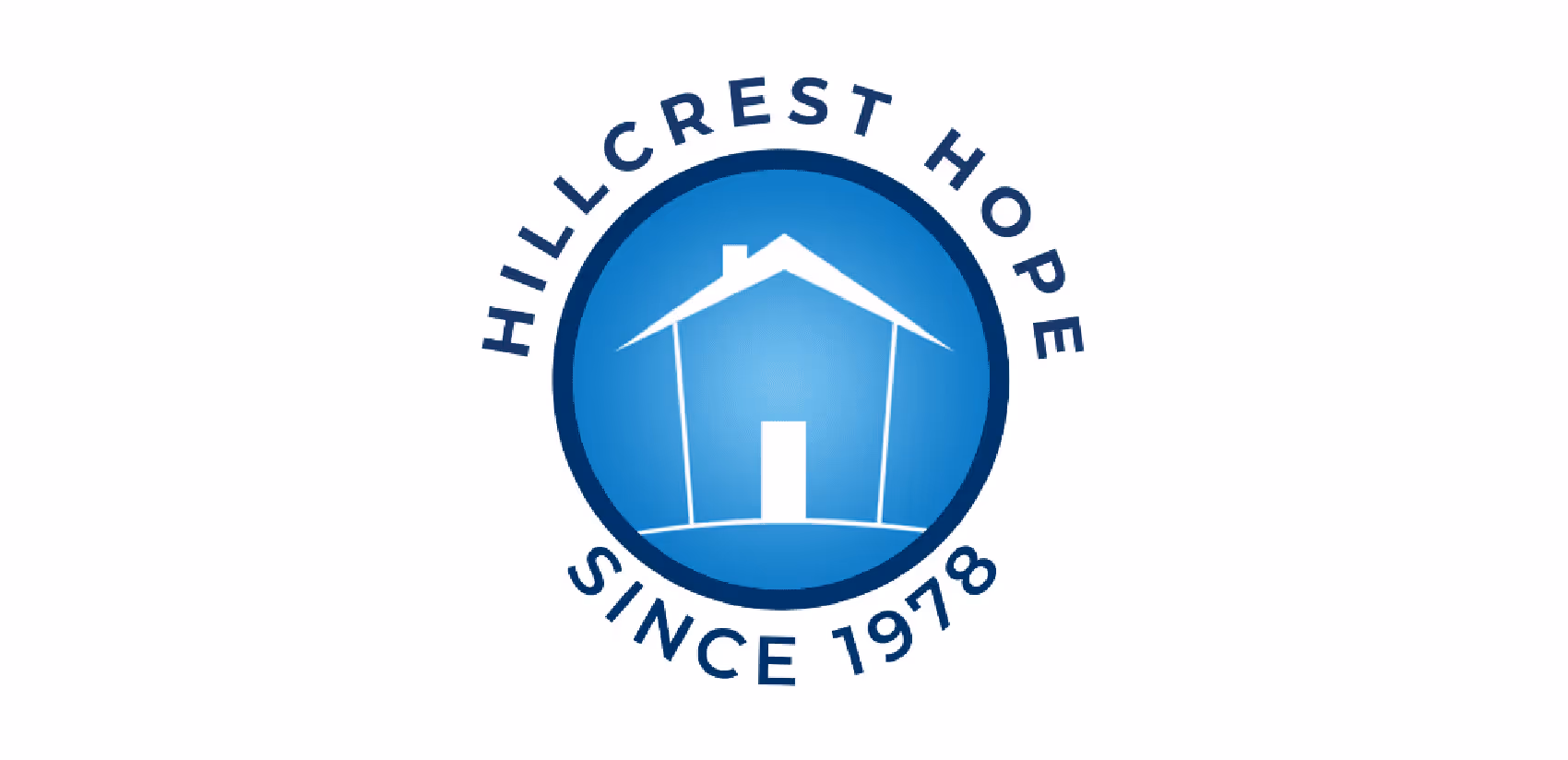
Our client, Thirst Relief International, embodies these first two design principles:
Rather than going into a lot of detail on its homepage, a photo and a few words let visitors know quickly what the organization does. If you want to expand on the detail, save it for pages deeper in your site.
Use Short Sentences
Short sentences are easier to read. If your copy is hard to read, visitors won’t know where to start reading and won’t be able to digest your content. Mix it up. If you need a long sentence, follow it with a short one. Variety helps.
Try Shorter Paragraphs
Use paragraph breaks to your advantage. It’s okay to write longer paragraphs, but if you keep homepage paragraphs to a few sentences, they’re easier to read. Consider using bullet points to keep it simple.
Start each paragraph with the new information, so if someone is scrolling they can quickly tell if they need to read that paragraph.

Make Your Call to Action (CTA) Clear and Obvious
Make your CTAs prominent, big, bold and powerful! Only 47 percent of websites have a CTA button that can be spotted in less than three seconds. Are you in that category? You can’t drive conversions without an effective CTA button. Don’t expect visitors to navigate back to your homepage to convert. Not going to happen.
Simplify Navigation
It shouldn’t be difficult for a website visitor to find what they’re looking for on your site.
I don’t know about you, but few things will cause me to leave a website faster than not being able to find what I’m searching for quickly. Nothing against web designers and IT types, but they don’t always think like the rest of us when it comes to categorizing things. The point is, that you have to put yourself in your user’s shoes, and then rectify anything that compromises their ability to move easily through your site. If visitors can’t figure your site out quickly, they’re going to leave. There’s no motivation for users to accept complex website navigation. There are many other options elsewhere in cyberspace.
It’s also a good idea to stick with a standard format. For example, 88 percent of websites have the main navigation menu positioned horizontally at the top of each page. If your menu is somewhere else, it’s going to confuse your visitors. And speaking of the menu (it is, after all, a major navigation gateway), the fewer menu options, the better. Otherwise, it will be too hard for people to find what they need. This concept is known as Hick’s Law. Giving people too many options can mean they take longer to make a decision. That’s why complex designs and navigations will crush your conversion rates.
Our client Greater Yellowstone Coalition provides a good example of a website that offers simple navigation and displays obvious CTAs.
Optimize Your Design for Mobile Devices

Mobile browsing continues to gain popularity. In 2019, 63 percent of Google’s organic search traffic originated from mobile devices. A mobile-optimized website is not only essential for the user experience, but it’s important for SEO purposes as well.
Search engines recognize this and reward sites that are mobile friendly. Google dominates mobile as well as desktop. Google knows that 87 percent of smartphone owners use their devices to run an Internet search at least once per day. In 2018, Google announced that it would be indexing websites based on their mobile versions, not their desktop version. The result: if your website is not optimized for mobile, you’ll get reduced Google traffic and, therefore, reduced conversions.
Monitor How Quickly Your Pages Load

What does page loading speed have to do with web design and conversions? Everything.
Slow loading times lead to high abandonment (bounce) rates. You can’t ignore this. If your pages take too long to load, you will end up with a big bounce rate and a small conversion rate.
Yes, it’s true that loading times are related to your website hosting plan, server, traffic, etc. However, design choices can also impact loading times. Adding images, videos and other complex media files can affect loading times.
Research has shown that if your website takes more than three seconds to load—yes, I said three seconds—40 percent of people will abandon your page! That’s 40 out of every 100 visitors you stand to lose if you’re not fast enough. One of our least attractive traits is that we are impatient (I’ve mentioned this a time or two in other posts). It gets even worse. Three seconds isn’t even fast enough for some people—46 percent of them expect pages to load in two seconds or less! There are a lot of very demanding people out there!
So how can you apply this to your web design?
- Reduce the file sizes of your images
- Take advantage of browser caching tools
- Reduce HTTP requests
- Improve your TTFB (time to first byte)
- Minify and combine your files
Fortunately, there are many tools available online to help you accomplish these things. For example, check out the WordPress Rocket plugin as a resource for minifying and combining your files. You can also use the Google Page Speed Insights tool to help you monitor your loading times whenever you make design changes on your website.
Continuously Run A/B Tests
No website is perfect and in the fast-paced world of technology, you can’t just set up your website and forget about it if you want positive results. And, as I pointed out in another recent post, you can’t make improvements if you don’t measure.
That’s why you need to run A/B tests. You can test nearly every element of your site design, including the:
- Location of your CTA button
- Color of your CTA button
- CTA copy
- Images that you’re using on landing pages
- Wording variations of text on the screen
- Size of your navigation bar
I hope these few suggestions are helpful. Learn more about the Google Ad Grant and let us know if you want to talk about ways to increase your conversion rate. We would be happy to help.
.svg)
.svg)
.svg)
.svg)

.avif)


.jpg)


.svg)
.svg)
.svg)
.svg)